Kitab Sawti is an Arabic audio entertainment service headquartered in Stockholm. It offers a wide range of audiobooks through their iOS and Android apps. I was very happy to have made it to their round of UI UX onboarding challenge. My submission for the challenge included two concepts:
Kitab Sawti is an Arabic audio entertainment service headquartered in Stockholm. It offers a wide range of audiobooks through their iOS and Android apps. I was very happy to have made it to their round of UI UX onboarding challenge. My submission for the challenge included two concepts:
Kitab Sawti is an Arabic audio entertainment service headquartered in Stockholm. It offers a wide range of audiobooks through their iOS and Android apps. I was very happy to have made it to their round of UI UX onboarding challenge. My submission for the challenge included two concepts:
Kitab Sawti is an Arabic audio entertainment service headquartered in Stockholm. It offers a wide range of audiobooks through their iOS and Android apps. I was very happy to have made it to their round of UI UX onboarding challenge. My submission for the challenge included two concepts:
Kitab Sawti is an Arabic audio entertainment service headquartered in Stockholm. It offers a wide range of audiobooks through their iOS and Android apps. I was very happy to have made it to their round of UI UX onboarding challenge. My submission for the challenge included two concepts:
Concept 1
Concept 1
- Book Covers
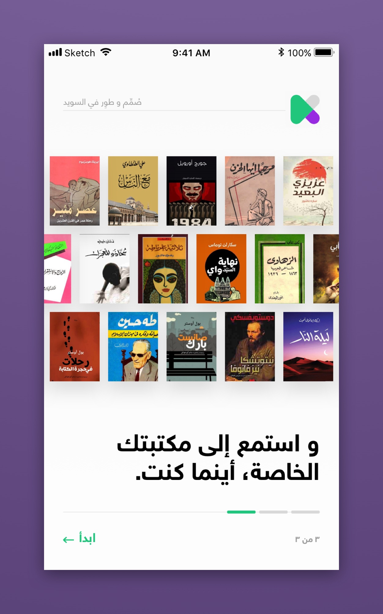
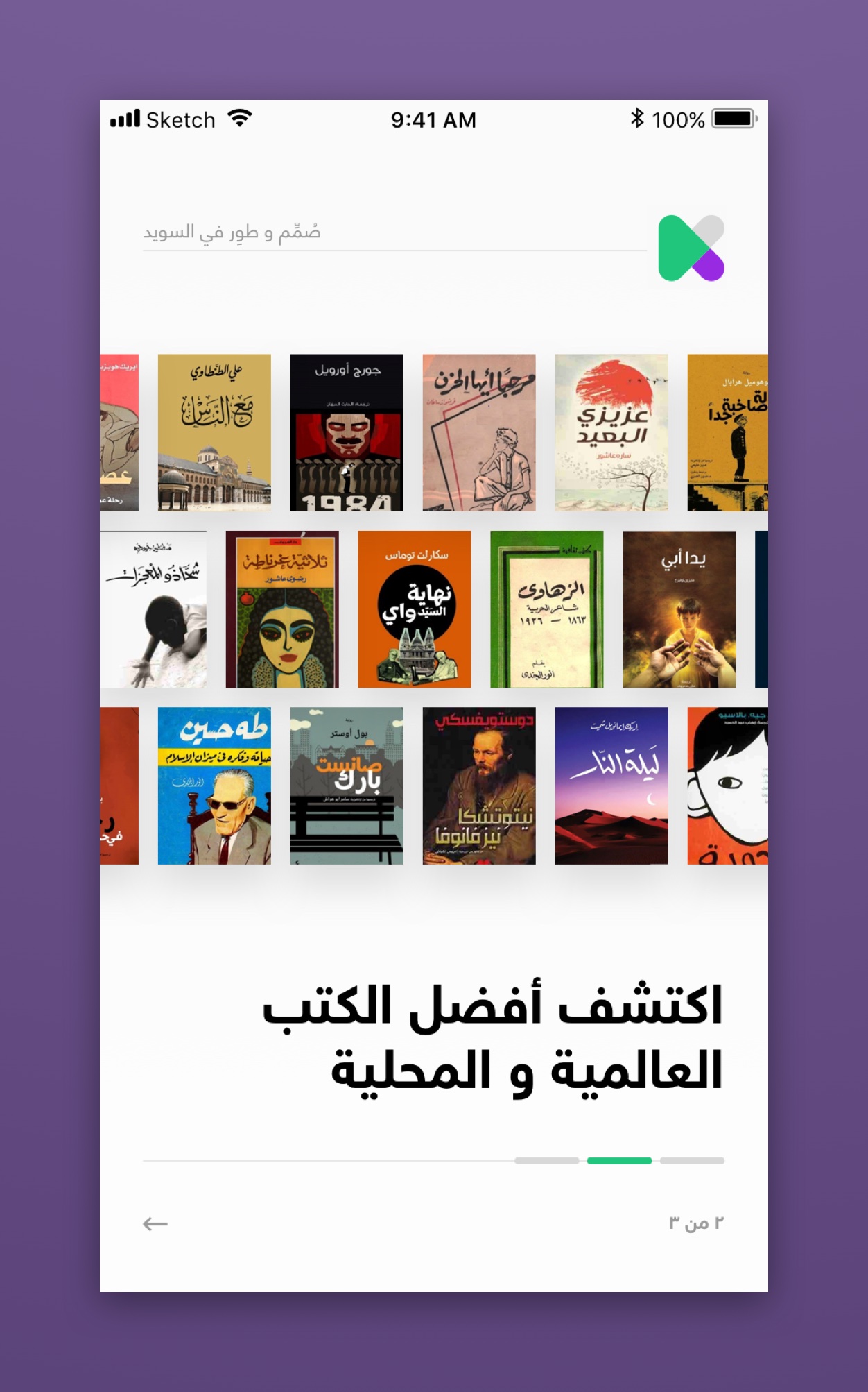
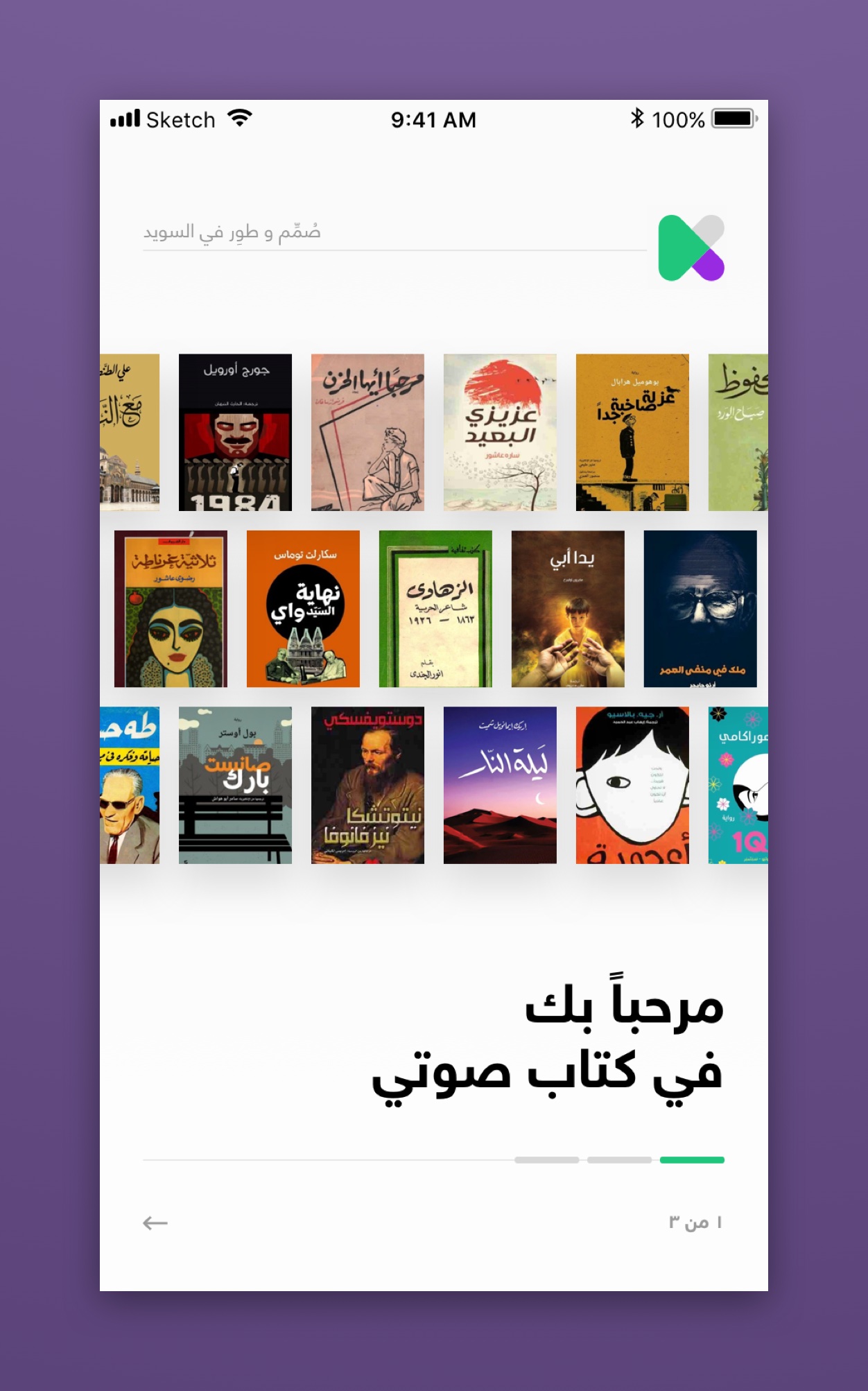
No stock images because they kill any brand identity. However, I used rows of book covers animating in slow motion on the span of all onboarding screens. By doing this:- The onboarding looks less boring.
- The slow motion gives the impression of infinity regarding the number of books.
- The interlock spacing amplifies this impression too.
- The book sizes are neither big nor small so that the titles are still legible.
- RTL Alignment
The onboarding screen starts with a right alignment which gives from the first impression that Kitab Sawti supports Arabic RTL. It also has a subtle book-reading connotation. These small touches convey the right message without having to actually say it out loud. - UX Copywriting
The three messages in the onboarding screens are precise and to the point without being instructional or dull. The three lines are:- Welcome to Kitab Sawti A warm welcome.
- Discover the best international and local books Here we pointed out to the featured books along with having best-selling releases.
- And listen to your library, wherever you are
. Pointing to the offline feature and having them organized in a library.
- UI Pagination
I used horizontal lines instead of the usual pagination dots to keep the overall composition of the design consistent. I also added a next button (the arrow), just in case the swiping isn’t too obvious. The written pagination (1 of x) happening in the bottom also adds to the book-reading connotation. - Package Selection, or Login
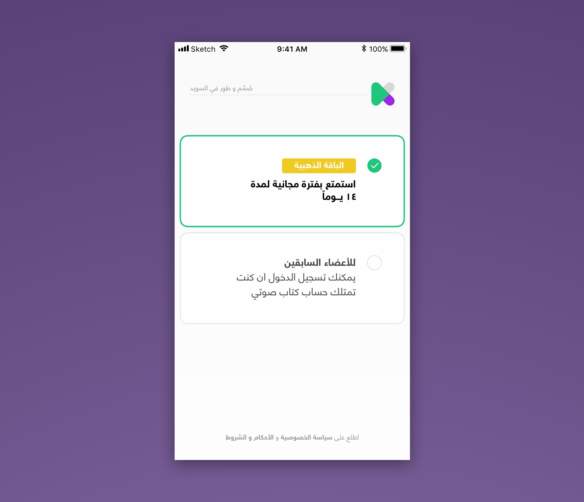
The trial version (14 days) is listed on top and pre-selected as default for new users. Existing members have the login option below that. If the app is deleted and reinstalled, the number of days shown in the trial period will change accordingly, and so will the text. This screen can accommodate more than two options or packages. I figured that there’s no need for a sign-up option on this list to keep the flow seamless. The sign-up will be required within the app when creating an account is necessary.
- Book Covers
No stock images because they kill any brand identity. However, I used rows of book covers animating in slow motion on the span of all onboarding screens. By doing this:- The onboarding looks less boring.
- The slow motion gives the impression of infinity regarding the number of books.
- The interlock spacing amplifies this impression too.
- The book sizes are neither big nor small so that the titles are still legible.
- RTL Alignment
The onboarding screen starts with a right alignment which gives from the first impression that Kitab Sawti supports Arabic RTL. It also has a subtle book-reading connotation. These small touches convey the right message without having to actually say it out loud. - UX Copywriting
The three messages in the onboarding screens are precise and to the point without being instructional or dull. The three lines are:- Welcome to Kitab Sawti A warm welcome.
- Discover the best international and local books Here we pointed out to the featured books along with having best-selling releases.
- And listen to your library, wherever you are.
Pointing to the the offline feature and having them organized in a library.
- UI Pagination
I used horizontal lines instead of the usual pagination dots to keep the overall composition of the design consistent. I also added a next button (the arrow), just in case the swiping isn’t too obvious. The written pagination (1 of x) happening in the bottom also adds to the book-reading connotation. - Package Selection, or Login
The trial version (14 days) is listed on top and pre-selected as default for new users. Existing members have the login option below that. If the app is deleted and reinstalled, the number of days shown in the trial period will change accordingly, and so will the text. This screen can accommodate more than two options or packages. I figured that there’s no need for a sign-up option on this list to keep the flow seamless. The sign-up will be required within the app when creating an account is necessary.
Concept 2
Concept 2
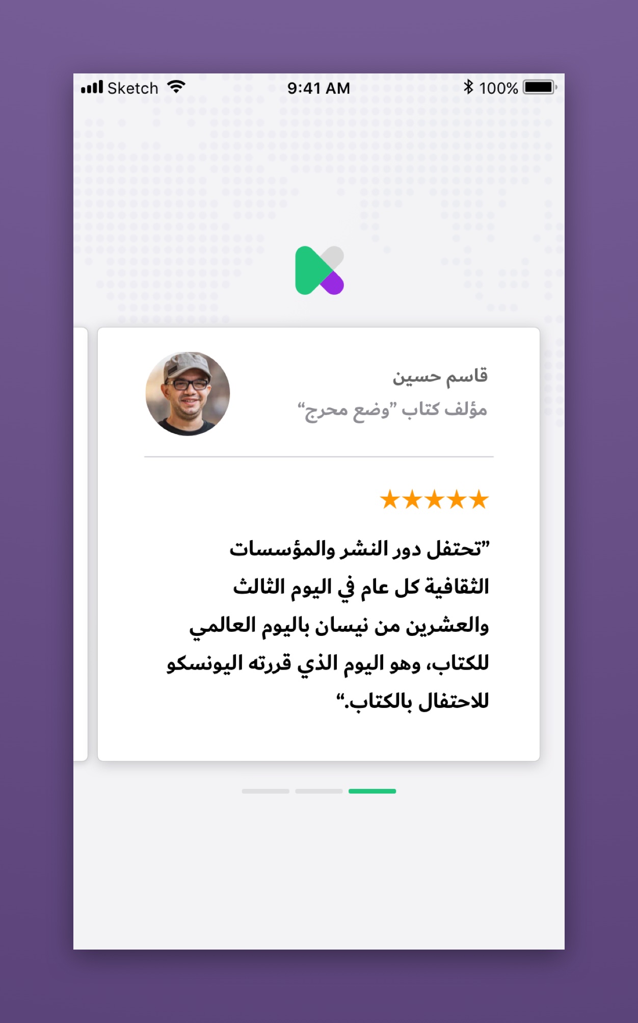
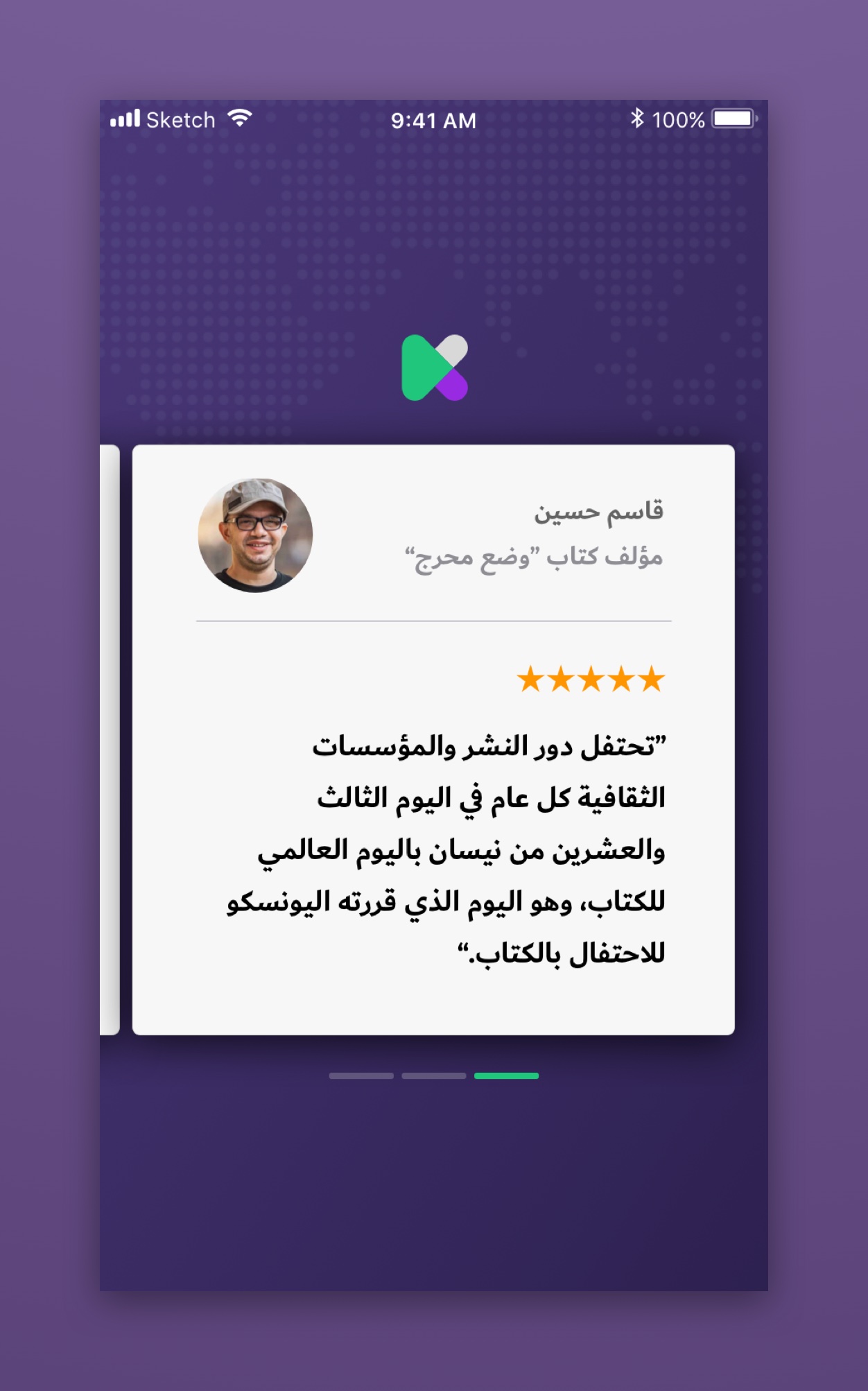
One of the most important components of physical book campaigns is the review they get by world-renowned authors. And book praise always precedes the first chapter. Example from an actual book:
“One of the more clever ways of introducing computational thinking to the general public.”
—Vint Cerf, Turing Award Winner, Chief Internet Evangelist at Google, a ‘Father of the Internet’
I thought it would be a clever idea to have Arabic renowned authors review Kitab Sawti. Their review –praise– will act as the onboarding.
Feedback?
jalal@aljazeeri.com
Feedback?
jalal@aljazeeri.com
Feedback?
jalal@aljazeeri.com
Feedback?
jalal@aljazeeri.com
Feedback?
jalal@aljazeeri.com
