HandBrake is an open-source video transcoder. It was one of the first media conversion software I installed on my new MacBook mainly because it was free. Over the years I tried other converters —paid and free— but they simply never delivered. So I always came back to HandBrake.
As a tribute to the author of HandBrake and its community of developers, this project was an effort to address the room it has for improvements. I will start by reviewing the current version of the software from a user-experience perspective and then suggest a redesign.
- The main window is overcrowded with input controls
It's a bit overwhelming to configure all the settings before a user can start converting files. They are always in your face. Staring. - Appeals to power users more
The settings in the bottom half of the window appeal to advanced users. For people like me, they're scary fields that I do not want to accidentally mess with. - Toggling presets
They're hidden out of sight. And there's no indication that the scary settings actually get pre-filled with user's selected presets. - Manual queueing
This might be my main annoyance with handbrake — I have to add each file one at a time, configure it, add then add it to a queue. Many times I have accidentally overwritten files that have already been converted because I forgot to change the name of the file in the destination field. - Separated windows
The preview, the activity log, and the jobs queue — all open unnecessary new windows. - Is there a way to remove a file I added by mistake?
When I accidentally add a wrong file and I want to remove it, I quit the program and start again. I just recently realized that I can drag and drop a file into the main window, and the previous/unwanted file will get replaced. Not very intuitive.
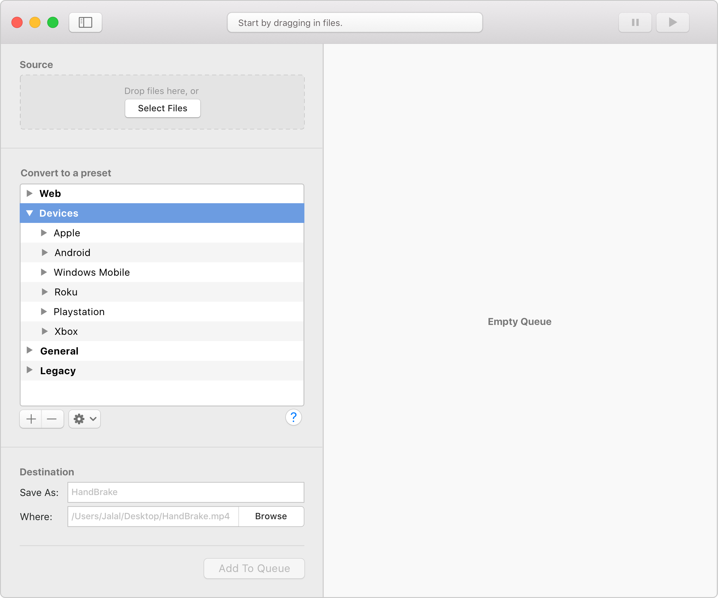
To address these comments, here's the proposed redesign — a single window solution with a native macOS look. This is the application in its initial state — first run:
The application has two adjacent panes. The left one for setting the configurations. And the right one is for the jobs queue. The top bar has a feedback/progress bar so that users are informed of the progress with a glance — rather than a whole new window. It can also serve to show guiding messages.
The application has two adjacent panes. The left one for setting the configurations. And the right one is for the jobs queue. The top bar has a feedback/progress bar so that users are informed of the progress with a glance — rather than a whole new window. It can also serve to show guiding messages.
As for the presets, the overwhelming settings are now hidden. Novice users can select a preset from the list, and they're ready to go. Superusers can adjust the settings of each preset by clicking on the settings button. Win-win.
As for the presets, the overwhelming settings are now hidden. Novice users can select a preset from the list, and they're ready to go. Superusers can adjust the settings of each preset by clicking on the settings button. Win-win.
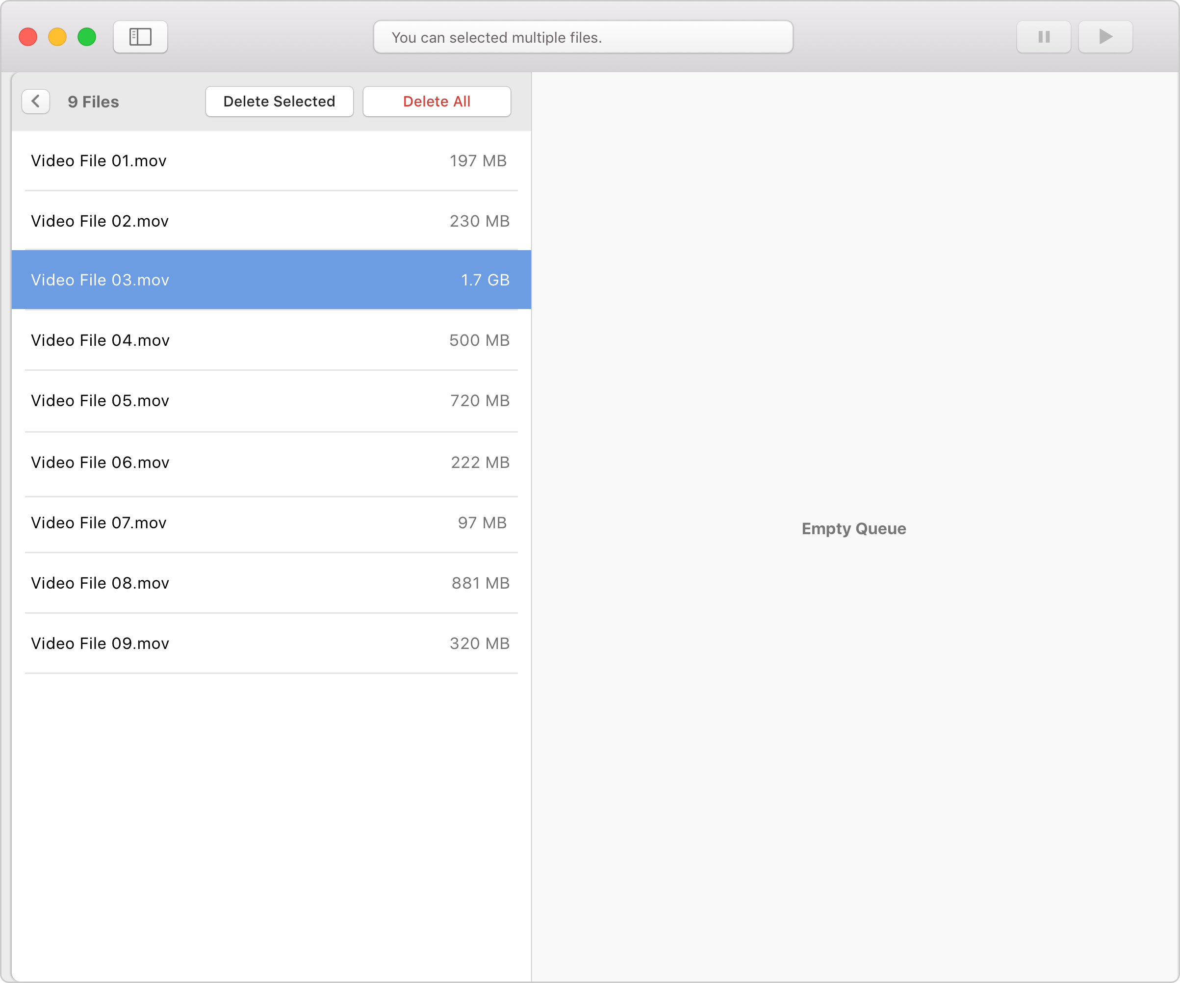
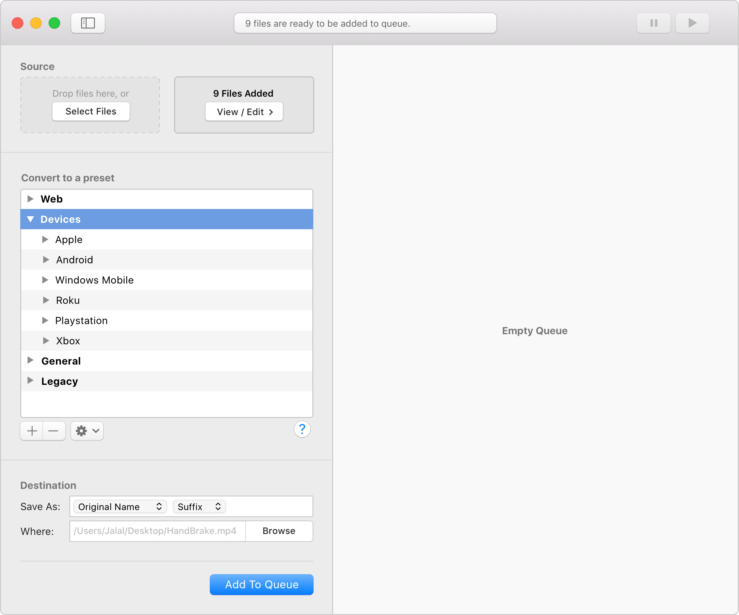
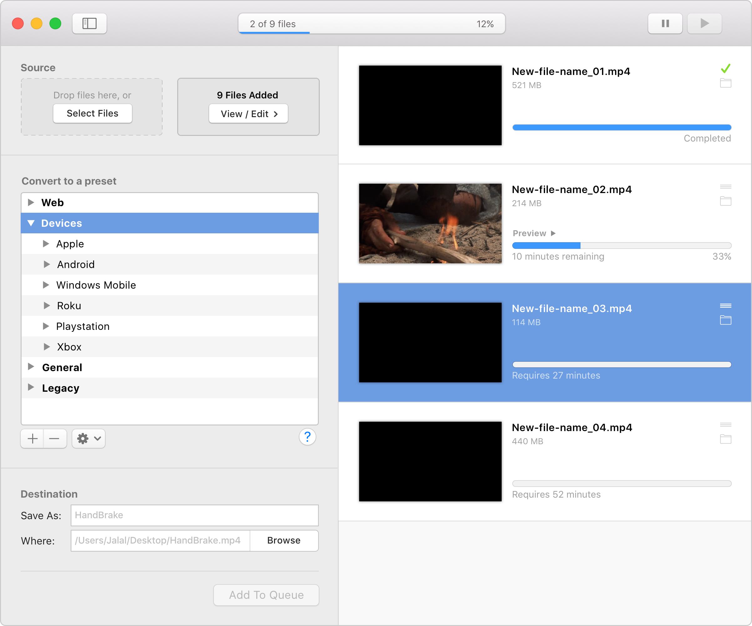
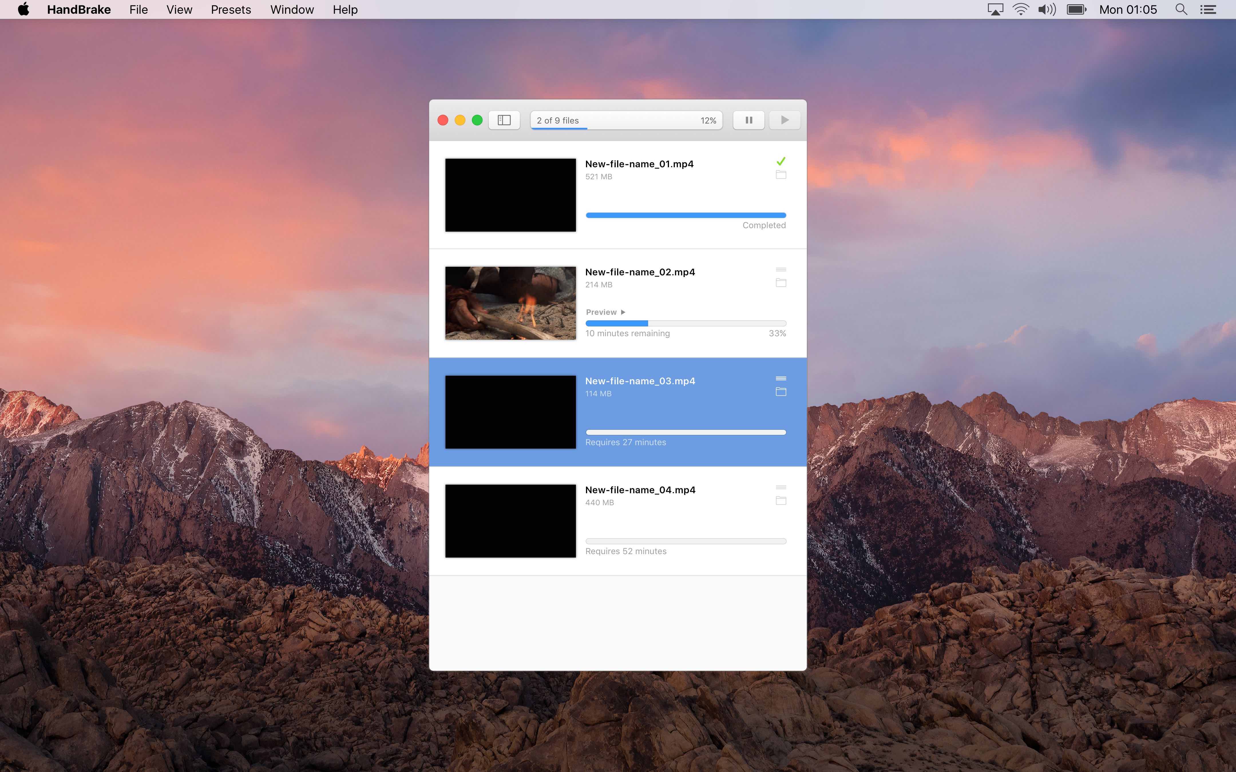
Once the 'add to queue' button is pressed, all added files will be listed on the right pane as jobs. The jobs can be reordered before converting starts. A preview option is available for the job which is currently in progress. And multiple files can be selected to be paused.
Once the 'add to queue' button is pressed, all added files will be listed on the right pane as jobs. The jobs can be reordered before converting starts. A preview option is available for the job which is currently in progress. And multiple files can be selected to be paused.
Once the 'add to queue' button is pressed, all added files will be listed on the right pane as jobs. The jobs can be reordered before converting starts. A preview option is available for the job which is currently in progress. And multiple files can be selected to be paused.
I'm sure there are more nuances that need to be validated against the redesign, but this is where I stop showcasing the concept.
I'm sure there are more nuances that need to be validated against the redesign, but this is where I stop showcasing the concept.
Feedback?
jalal@aljazeeri.com
Feedback?
jalal@aljazeeri.com
Feedback?
jalal@aljazeeri.com
Feedback?
jalal@aljazeeri.com
Feedback?
jalal@aljazeeri.com
