
Altafsir.com is an excellent resource for Quranic research. It unbiasedly includes a comprehensive collection of tafsir (exegesis) books along with advanced features. It was brought into being in 2001, became noticeably popular in 2006, and it has gained respectable credibility ever since because of its remarkable content. The average number of visits the website had in the past four years exceeded 11 million visits. However, the Internet has obviously improved a lot since 2001, and altafsir.com has serious room for improvements in terms of user interaction and visual design. I picked this website to redesign because:
- Its content is truly a remarkable effort. It deserves to be maintained in a more inviting way.
- The redesign concept is a way to support altafsir's initiative and to encourage action towards a well-deserved and a long overdue update.
- I personally use it on a regular basis to look up interpretations, and I wish to see it overcome its shortcomings.
Review of the current website
Review of the current website
- The homepage
The homepage unnecessarily has duplicate main menus – one in Arabic and one in English. The homepage also always lands on an introductory cover page first. It might not be a big deal, but it's always one extra click to get to the real meat. - Proportions
In all browsers, a 30 to 40 percent of all pages is eaten up by a blank white space. - The navigation menu
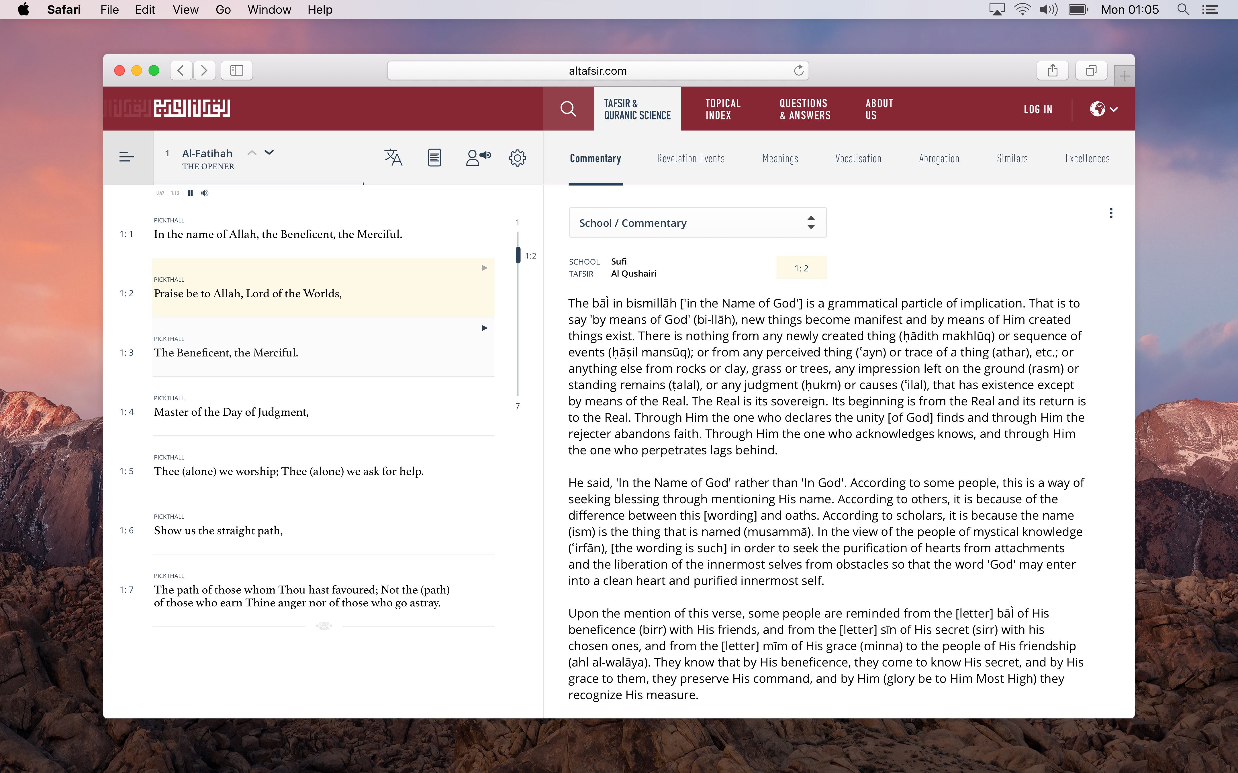
It's a long list of 13 main menu items which can be categorically grouped in a less cluttered manner. It's even more overwhelming when you scroll down to find a whopping list of 10 scattered titles that are again, uncategorized. There's no indication of what these titles are, but upon experimentation, you learn that most of the titles are just links to books in PDF format. - Selecting chapters and verses
In all the pages, selecting Quran chapters or verses is an exhausting mining process. The dropdown control is overly abused. Repeatedly. In all pages. And on top of that, the entire website reloads every time after every single selection. - A confusing overall structure
Many features of the website (mainly the features under recitation sciences, and Quranic sciences) are interlacing shortcuts within one another creating redundant and unpredictable navigational behavior. - Pagination
The tafsir section of the website has needless pagination breaks after every few paragraphs. Again, the whole website reloads after every page turn.
- The homepage
The homepage unnecessarily has duplicate main menus – one in Arabic and one in English. The homepage also always lands on an introductory cover page first. It might not be a big deal, but it's always one extra click to get to the real meat. - Proportions
In all browsers, a 30 to 40 percent of all pages is eaten up by a blank white space. - The navigation menu
It's a long list of 13 main menu items which can be categorically grouped in a less cluttered manner. It's even more overwhelming when you scroll down to find a whopping list of 10 scattered titles that are again, uncategorized. There's no indication of what these titles are, but upon experimentation, you learn that most of the titles are just links to books in PDF format. - Selecting chapters and verses
In all the pages, selecting Quran chapters or verses is an exhausting mining process. The dropdown control is overly abused. Repeatedly. In all pages. And on top of that, the entire website reloads every time after every single selection. - A confusing overall structure
Many features of the website (mainly the features under recitation sciences, and Quranic sciences) are interlacing shortcuts within one another creating redundant and unpredictable navigational behavior. - Pagination
The tafsir section of the website has needless pagination breaks after every few paragraphs. Again, the whole website reloads after every page turn.
Influences
When I research Quranic meanings, I combine altafsir.com with two other websites: 1. quranwow.com and 2. quran.com. They both offer pretty much the same thing: translation works from legitimate translators. I switch between both because quranwow.com offers more English translations, while quran.com has an exceptional intelligent search. They both have modern designs and perform really well. However, they are both targeted towards offering translations only without interpretations. Using and evaluating both websites in terms of what works and what doesn't, is what inspired the redesign concept for altafsir's website. They provided valuable insights in generating the redesign decisions and goals.
When I research Quranic meanings, I combine altafsir.com with two other websites: 1. quranwow.com and 2. quran.com. They both offer pretty much the same thing: translation works from legitimate translators. I switch between both because quranwow.com offers more English translations, while quran.com has an exceptional intelligent search. They both have modern designs and perform really well. However, they are both targeted towards offering translations only without interpretations. Using and evaluating both websites in terms of what works and what doesn't, is what inspired the redesign concept for altafsir's website. They provided valuable insights in generating the redesign decisions and goals.
The Redesign
The Redesign
Notes:
- This is a personal effort and it was not based on any statistical input from different types of users. The job isn't complete. It can only serve as an initial direction concept that requires further tweaking and remodeling based on proper research.
- The conceptual and wire-framing stages have been left out to avoid verbosity.
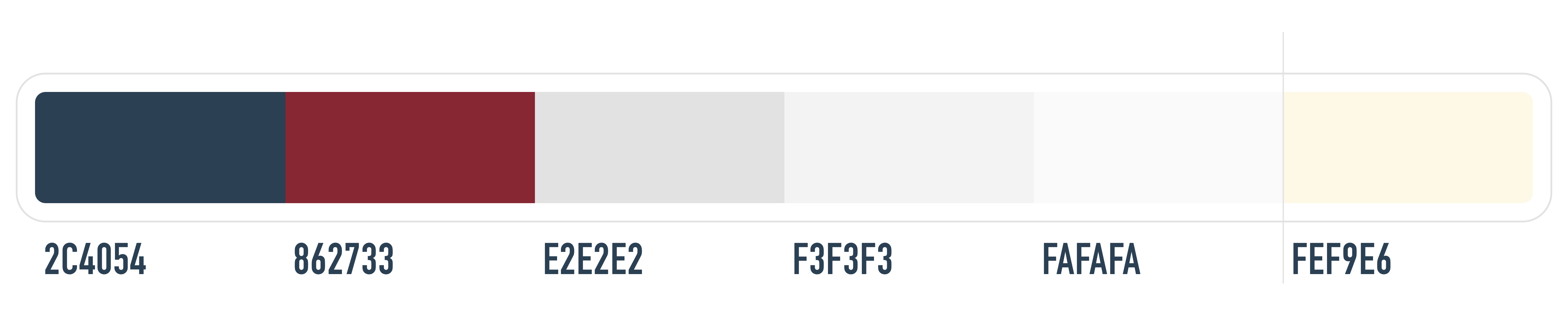
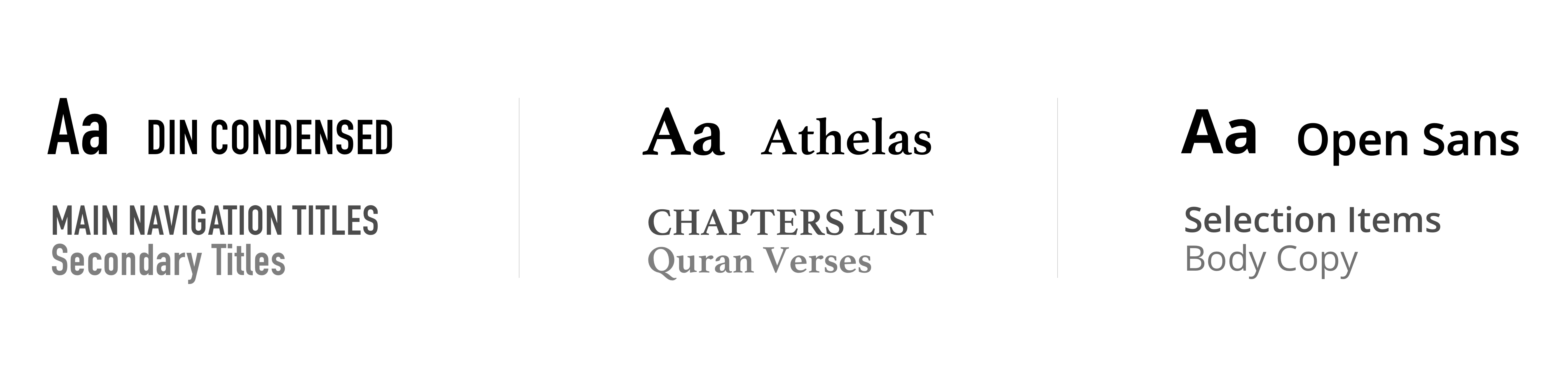
With that said, on with the redesign. The color scheme from the original website is kept somehow intact to preserve its original identity, and a modern typography is introduced.
Notes:
- This is a personal effort and it was not based on any statistical input from different types of users. The job isn't complete. It can only serve as an initial direction concept that requires further tweaking and remodeling based on proper research.
- The conceptual and wire-framing stages have been left out to avoid verbosity.
With that said, on with the redesign. The color scheme from the original website is kept somehow intact to preserve its original identity, and a modern typography is introduced.
Homepage
Part 1 of 4
Homepage
Part 1 of 4
After many design iterations, voilà:
After many design iterations, voilà:
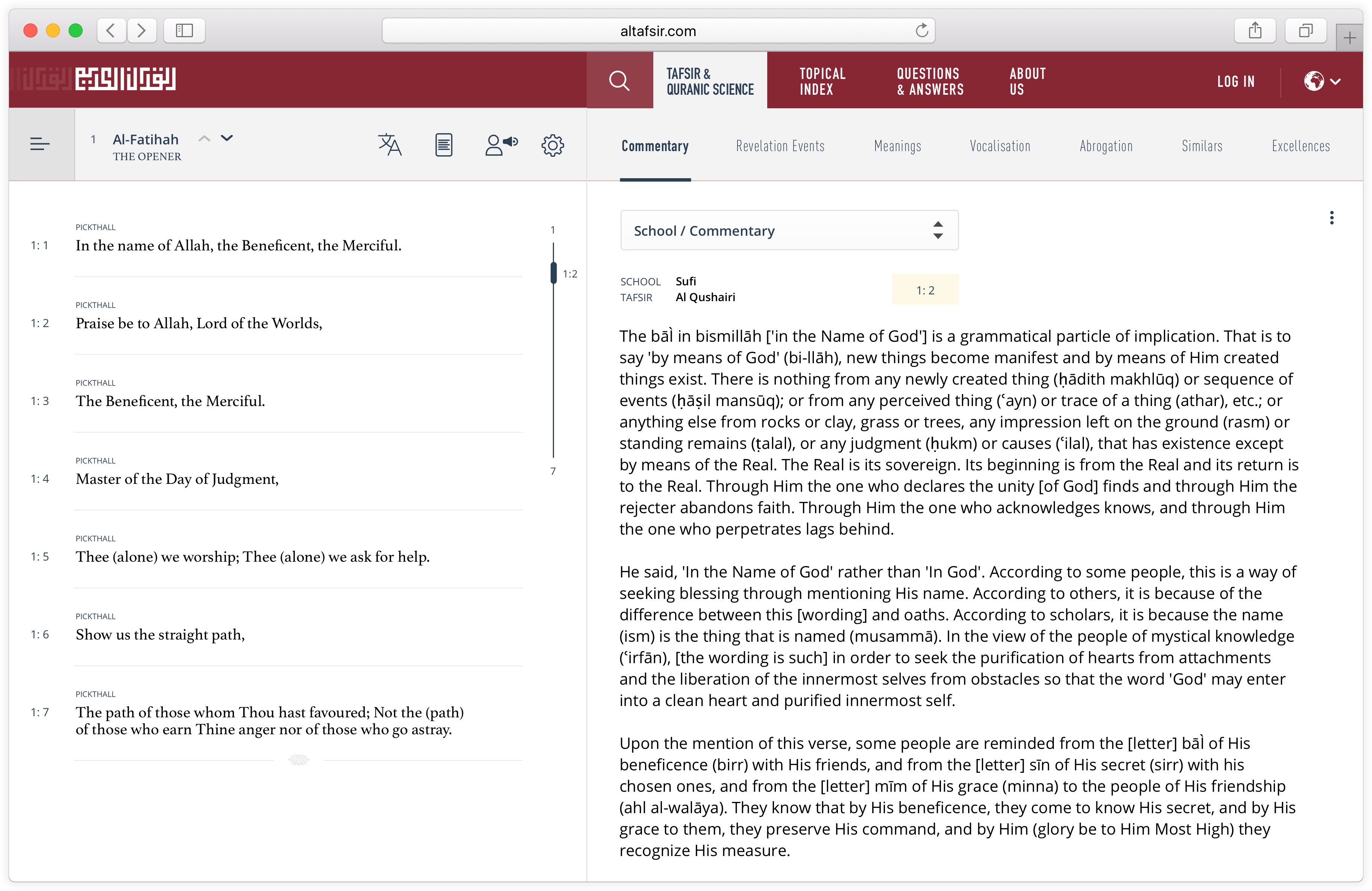
By scrapping the splash screen, the website will land on the first navigational tab: 'Tafsir & Quranic Sciences'. This tab is the focal point of the website. The website's primary goals can be performed here instantly within one window. It is a totalitarian canvas encompassing two panes. The left pane lists the Quran verses, and the right one details the Quranic sciences associated with the selected verses. The list of Quran chapters is hidden in a drawer off the canvas. When the list button is clicked, the whole canvas will slide off the screen from the left to allow chapters selection.
By scrapping the splash screen, the website will land on the first navigational tab: 'Tafsir & Quranic Sciences'. This tab is the focal point of the website. The website's primary goals can be performed here instantly within one window. It is a totalitarian canvas encompassing two panes. The left pane lists the Quran verses, and the right one details the Quranic sciences associated with the selected verses. The list of Quran chapters is hidden in a drawer off the canvas. When the list button is clicked, the whole canvas will slide off the screen from the left to allow chapters selection.
This approach—shifting the whole screen to the right as opposed to popping over a drawer— was an important design decision. It allows for scenarios where users might want to only read, skim through or interact with different chapters on a minimal level. It eliminates the hurdle of clicking back and forth. In short, if users just want to go through chapters of the Quran, users won't need to continuously open a drawer —or a drop-down menu for that matter. The details pane concurrently gets blurred for a clean reading mode, and to indicate that interaction with this pane is disabled. However, when a verse is selected, the chapters drawer will automatically slide back off screen, and the details pane will load.
This approach—shifting the whole screen to the right as opposed to popping over a drawer— was an important design decision. It allows for scenarios where users might want to only read, skim through or interact with different chapters on a minimal level. It eliminates the hurdle of clicking back and forth. In short, if users just want to go through chapters of the Quran, users won't need to continuously open a drawer —or a drop-down menu for that matter. The details pane concurrently gets blurred for a clean reading mode, and to indicate that interaction with this pane is disabled. However, when a verse is selected, the chapters drawer will automatically slide back off screen, and the details pane will load.
Anatomy
Part 2 of 4
Anatomy
Part 2 of 4
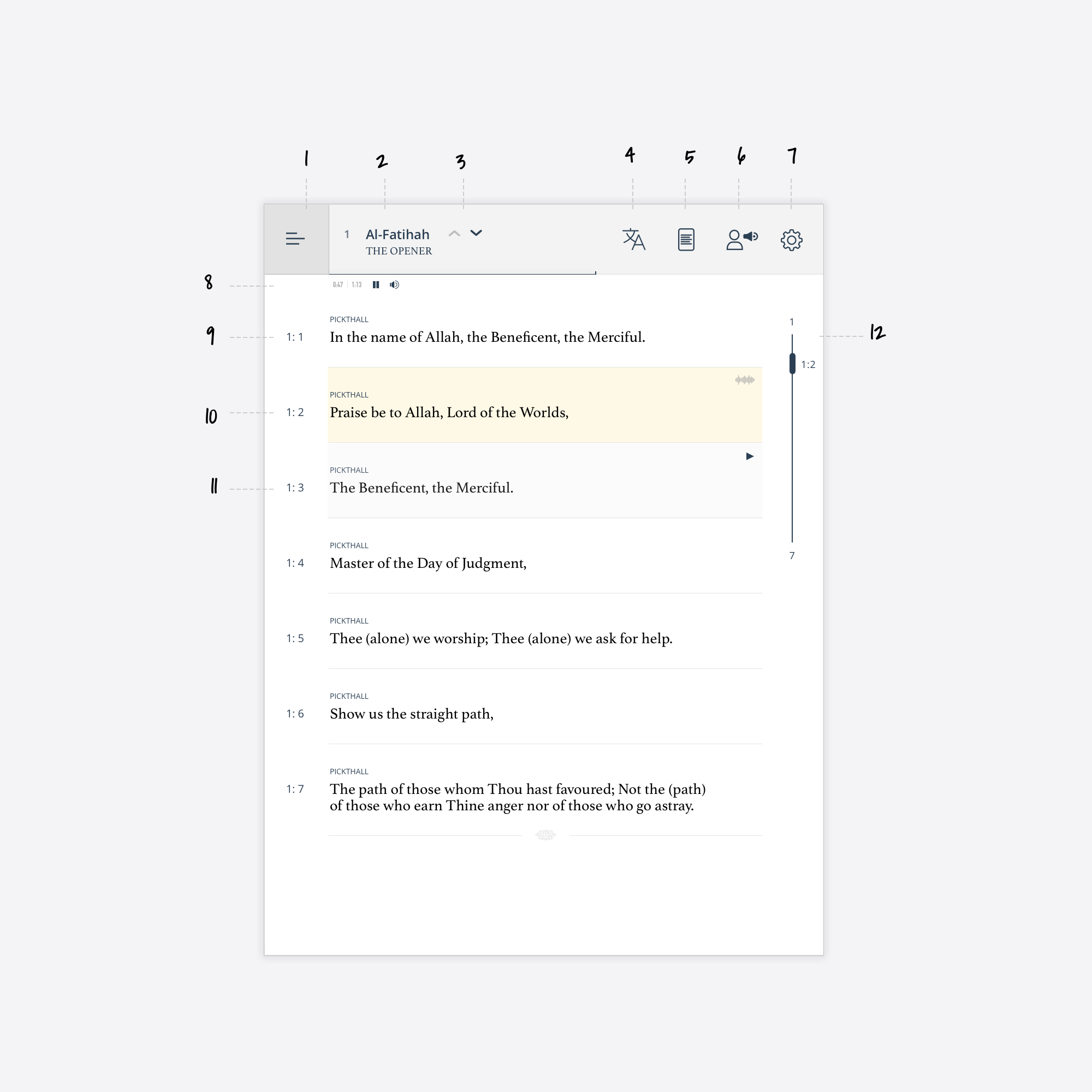
Veres Pane
- Show list of chapters.
- Selected chapter title and number.
- Go to next/previous chapters.
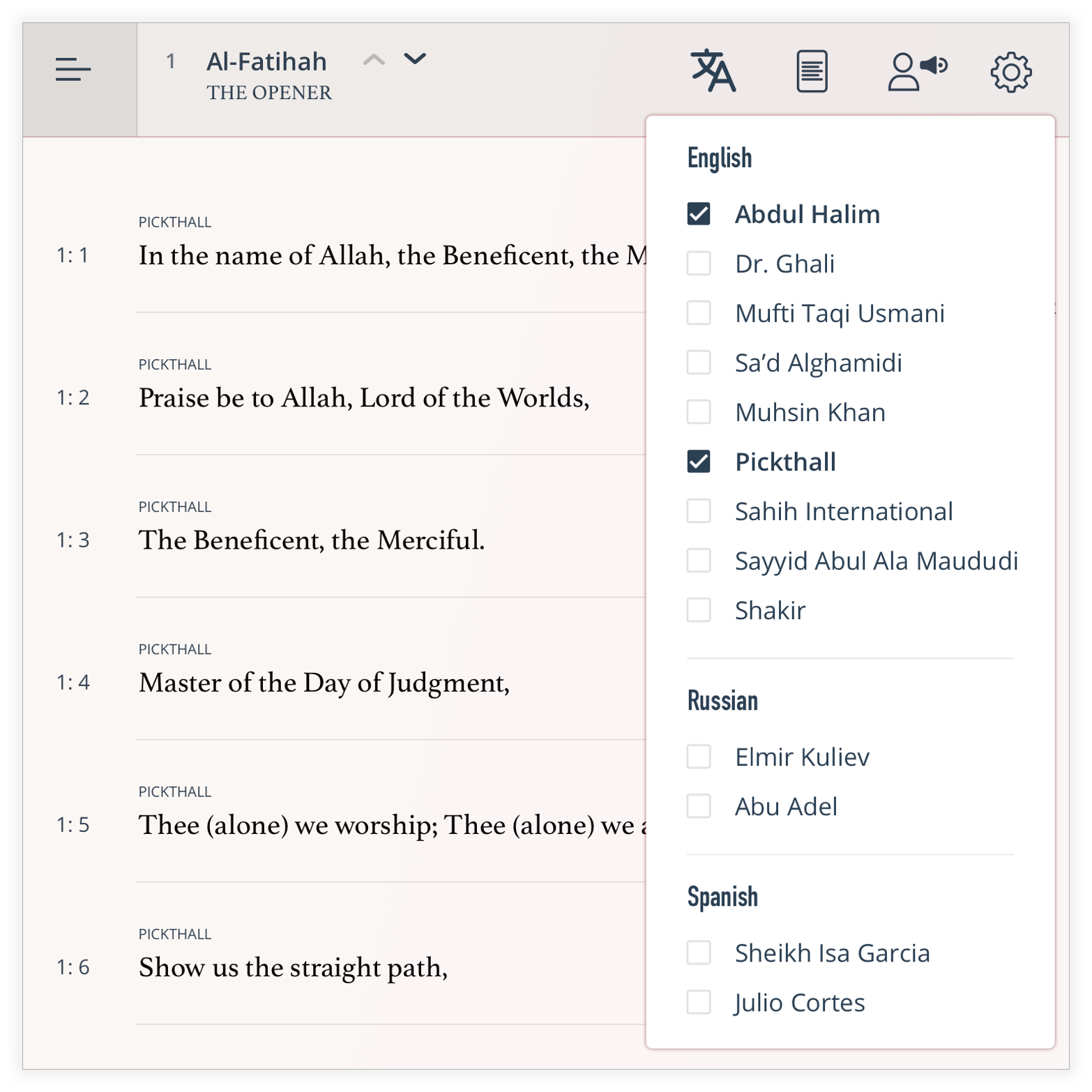
- Select translators.
- Reading view. Either in rows or continuous.
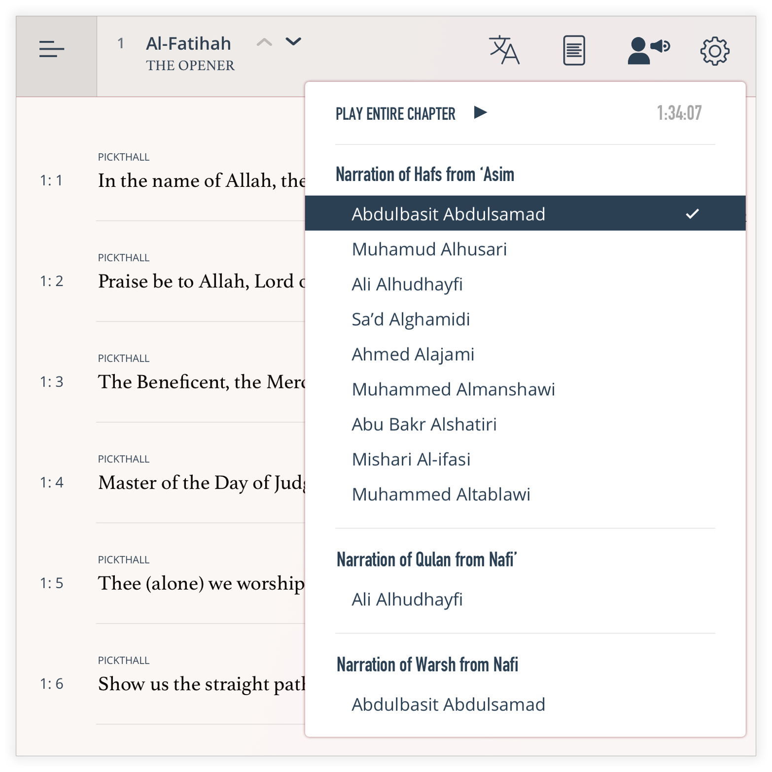
- Select a reciter.
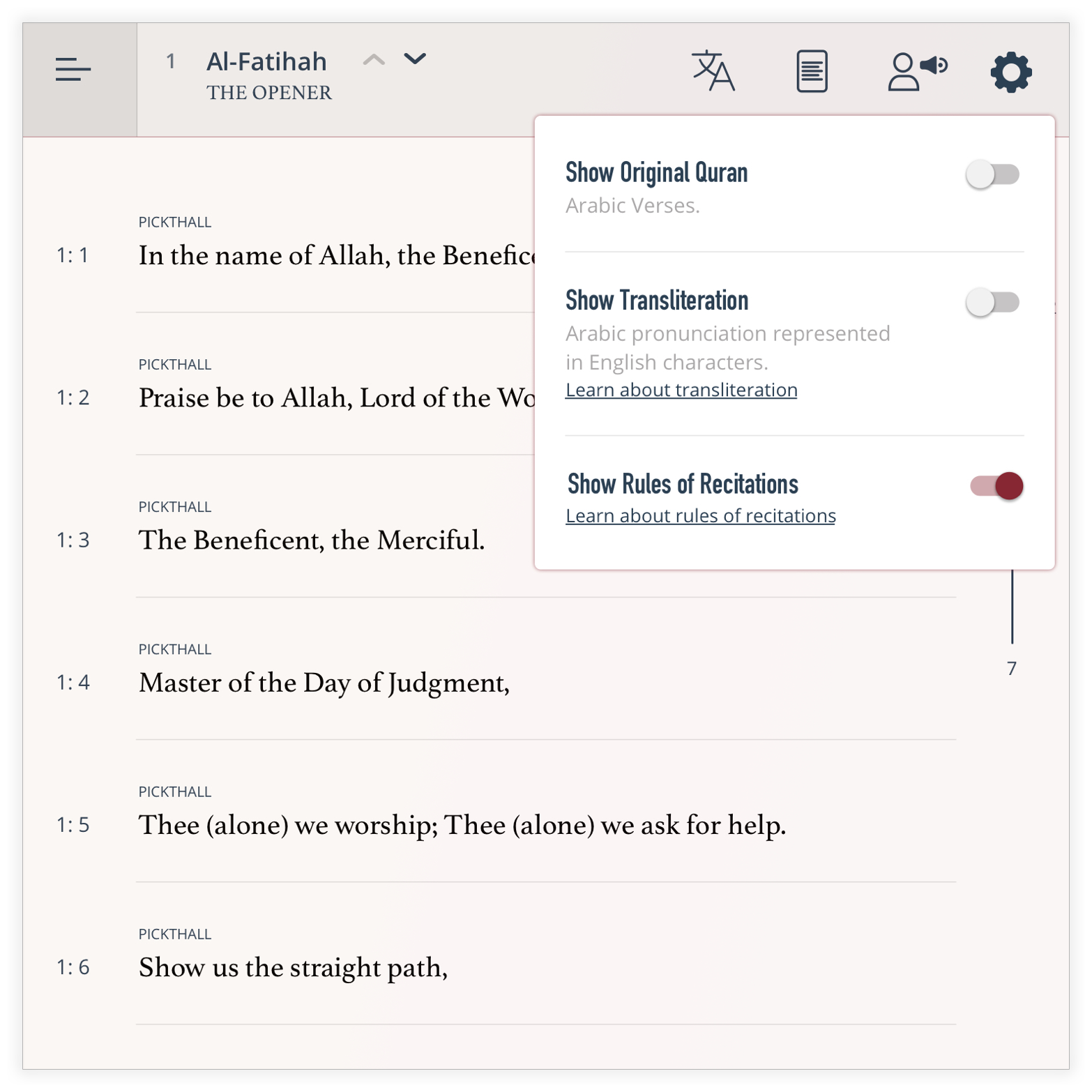
- Various setting options like transliteration and recitation rules.
- Audio controls; pause, resume, time.
- In the rows-reading mode, each verse is placed separately with the name of the translator on top.
- The selected verse is highlighted. The audio-waves will animate if it's playing.
- Hover-over shade.
- A custom scroller. It shows the total number of verses, and gives an easy jump to verses. It scrolls automatically while reading.
Veres Pane
- Show list of chapters.
- Selected chapter title and number.
- Go to next/previous chapters.
- Select translators.
- Reading view. Either in rows or continuous.
- Select a reciter.
- Various setting options like transliteration and recitation rules.
- Audio controls; pause, resume, time.
- In the rows-reading mode, each verse is placed separately with the name of the translator on top.
- The selected verse is highlighted. The audio-waves will animate if it's playing.
- Hover-over shade.
- A custom scroller. It shows the total number of verses, and gives an easy jump to verses. It scrolls automatically while reading.
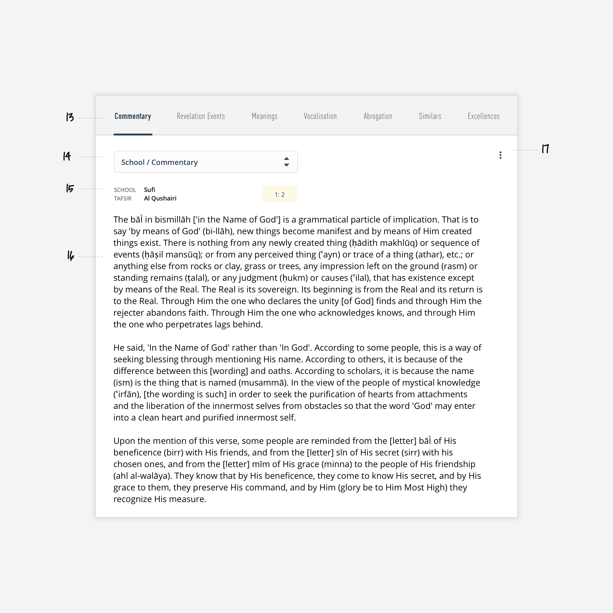
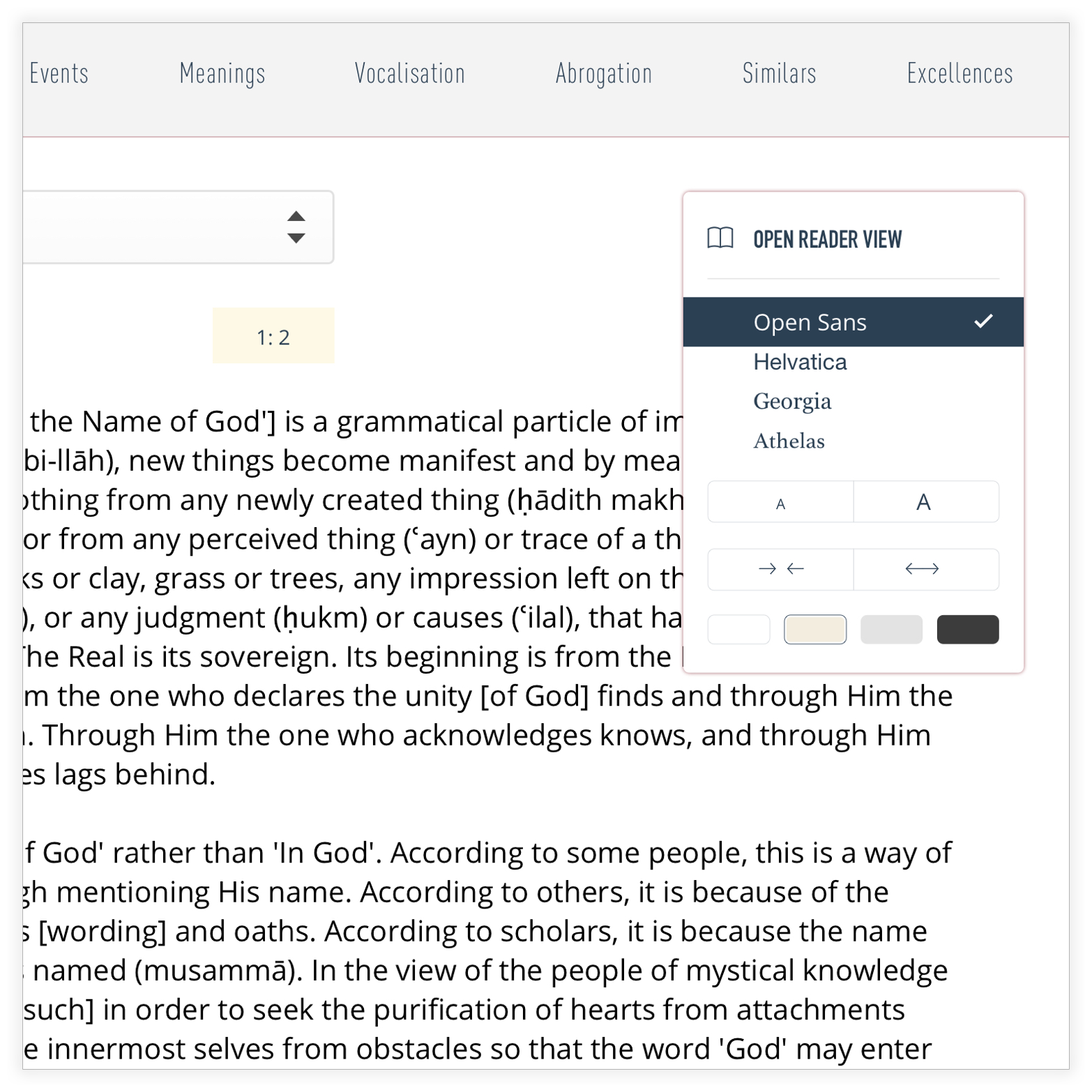
Details Pane
- Quranic sciences tabs: commentaries, revelations context, meanings, vocalization, etc.
- List of books and which school of thoughts they belong too.
- The selected book and the selected verse associated with it.
- Infinite scrolling content (i.e no painful pagination).
- Reading options: background color, text color and size and other formatting options.
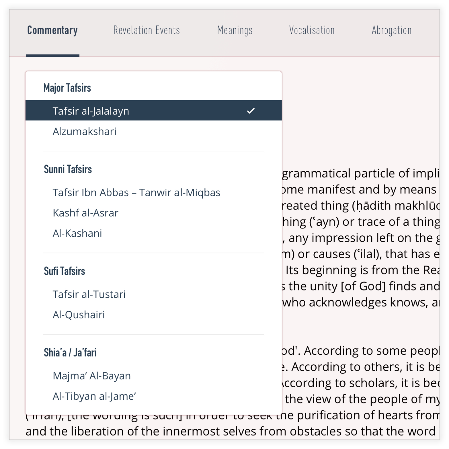
Drop-downs
Part 3 of 4
Drop-downs
Part 3 of 4
Out with the old dysfunctional selection lists.
In with the group-organized selection lists.
Click on a screenshot to enlarge it.
Out with the old dysfunctional selection lists.
In with the group-organized selection lists.
Click on a screenshot to enlarge it.
Generic Content Page
Part 4 of 4
Generic Content Page
Part 4 of 4
And that's a wrap.
And that's a wrap.
There are of course missing screens and the proposed concept needs to be validated, but this is where I stop. Also, if the team behind altafsir do welcome an overhaul, more user involvement is an idea worth exploring. The website can prompt scholarly users to contribute to the website's content – things like pointing out discrepancies, or adding missing content. Something akin to Wikipedia. With annotations now being a W3C web standard, this can be highly constructive.
________
The logo in the proposed designed was designed using Typo Grid. An online tool developed by the talented Bahraini calligrapher Qassim Haider.
Feedback?
jalal@aljazeeri.com
Feedback?
jalal@aljazeeri.com
Feedback?
jalal@aljazeeri.com
Feedback?
jalal@aljazeeri.com
Feedback?
jalal@aljazeeri.com